geometric abstraction
Review by Michael Welzenbach
Although realism and neo-expressionism have dominated mainstream fine art for the past decade, formal abstraction has continued to attract a large number of practitioners. On the periphery, away from the stylish New York millieu, abstraction has flourished. Some of today's most sought- after artists are abstract painters such as the West Coast's Richard Diebenkorn and Washington Color School alumnus Kenneth Noland.
Washington has a strong modernist tradition of abstraction, rooted in the work of Morris Louis, Gene Davis and Howard Mehring, and continued by their former colleagues, among these Jacob Kainen and Leon Berkowitz. And there is a whole school of younger painters who continue to wrest new, exciting images from the abstract mode. One on the best of these is Nan Montgomery.
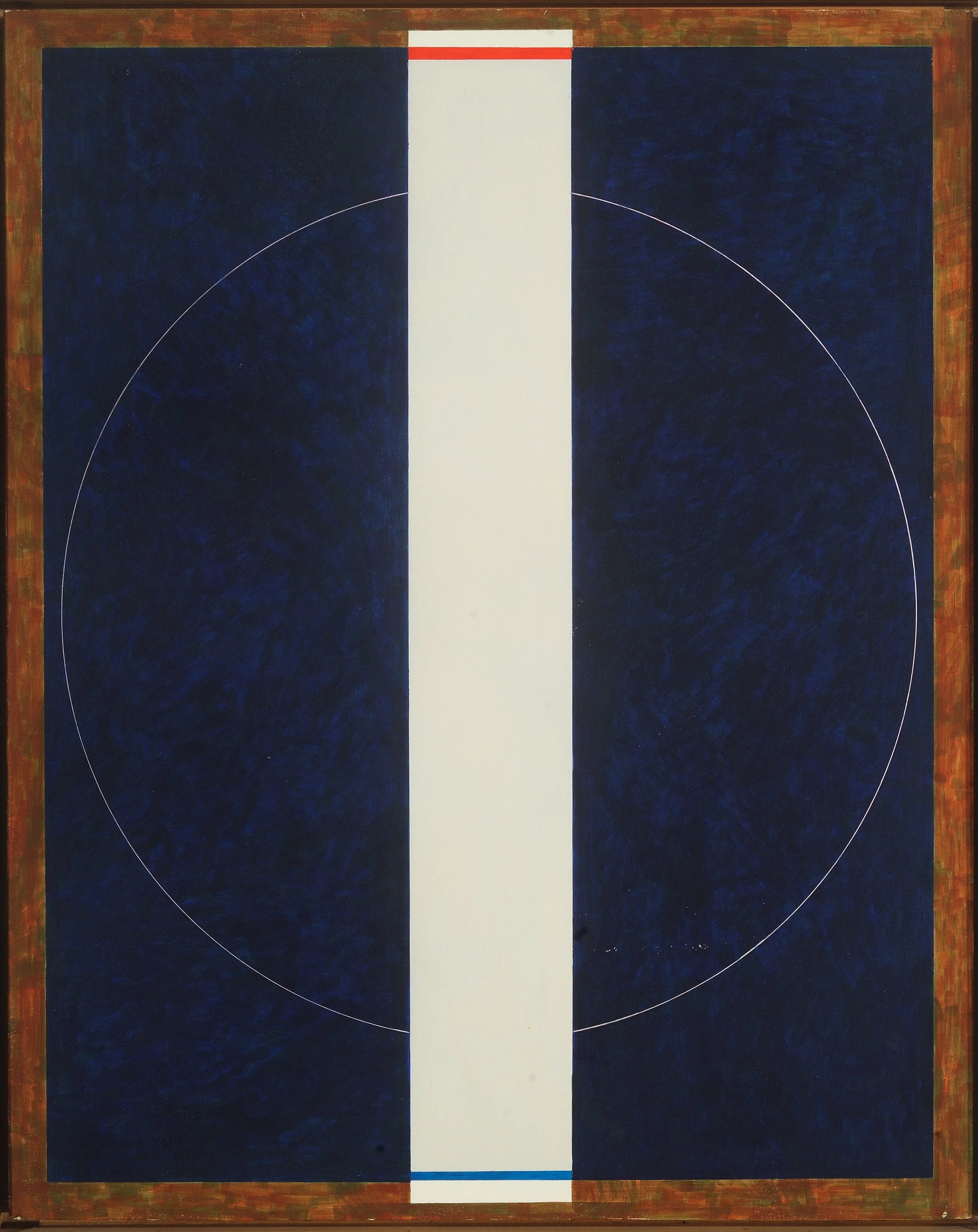
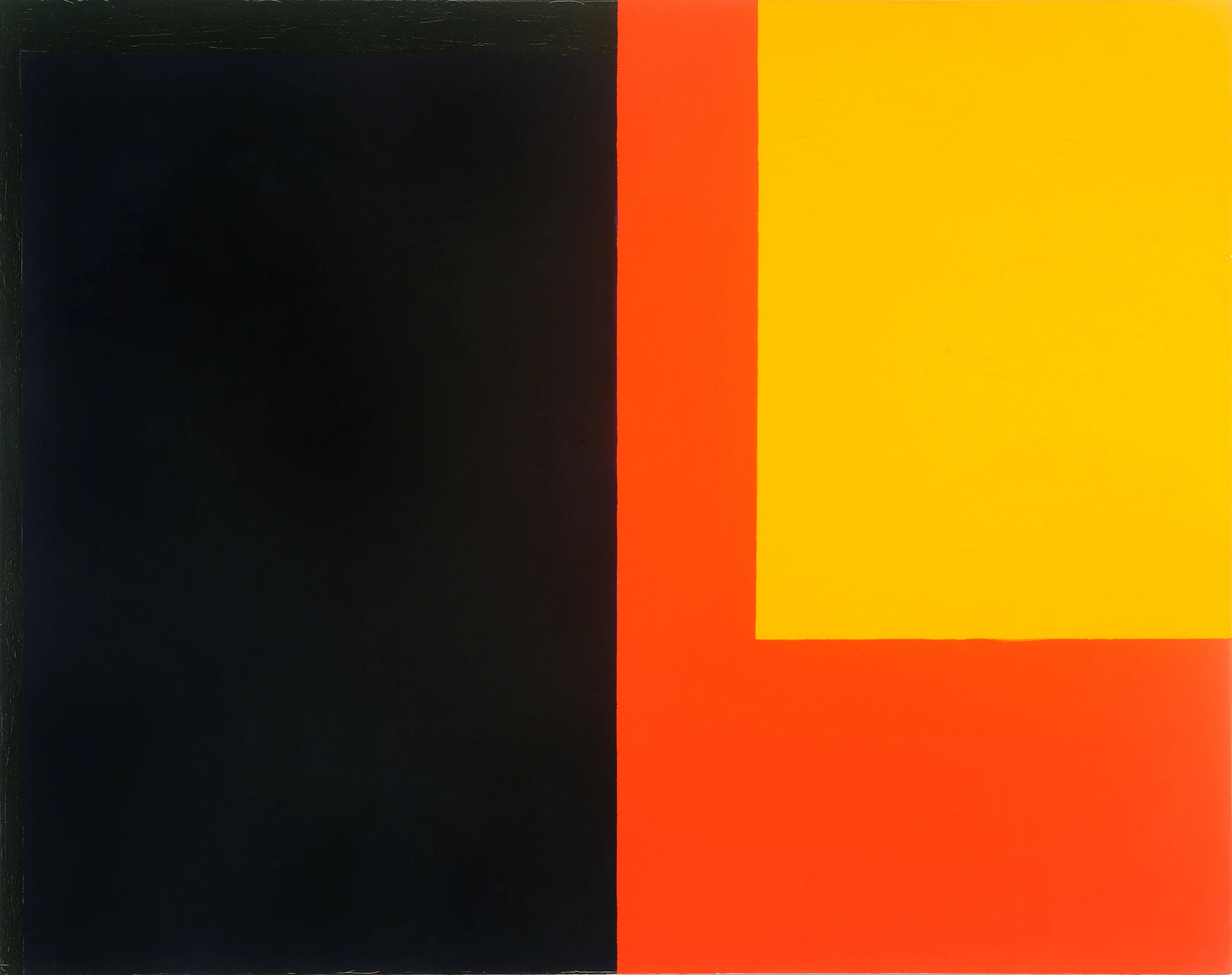
Miss Montgomery's newest exhibit…is a tour de force. Though there are several failures, the best pieces in the show, such as “Scalene” and “Red Morning” are elegant paradigms of formal abstraction which trace a lineage back to the work of Piet Mondrian.
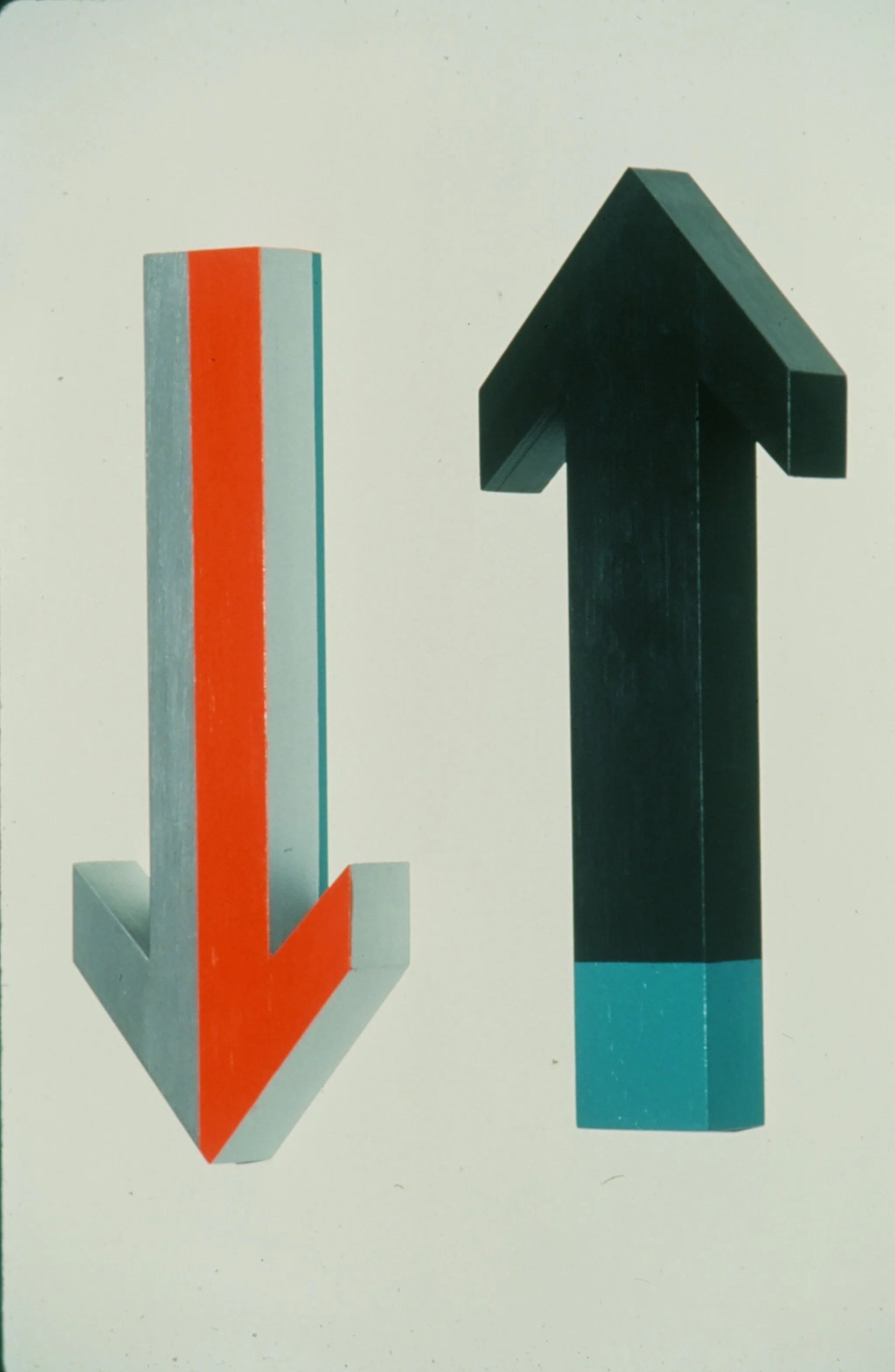
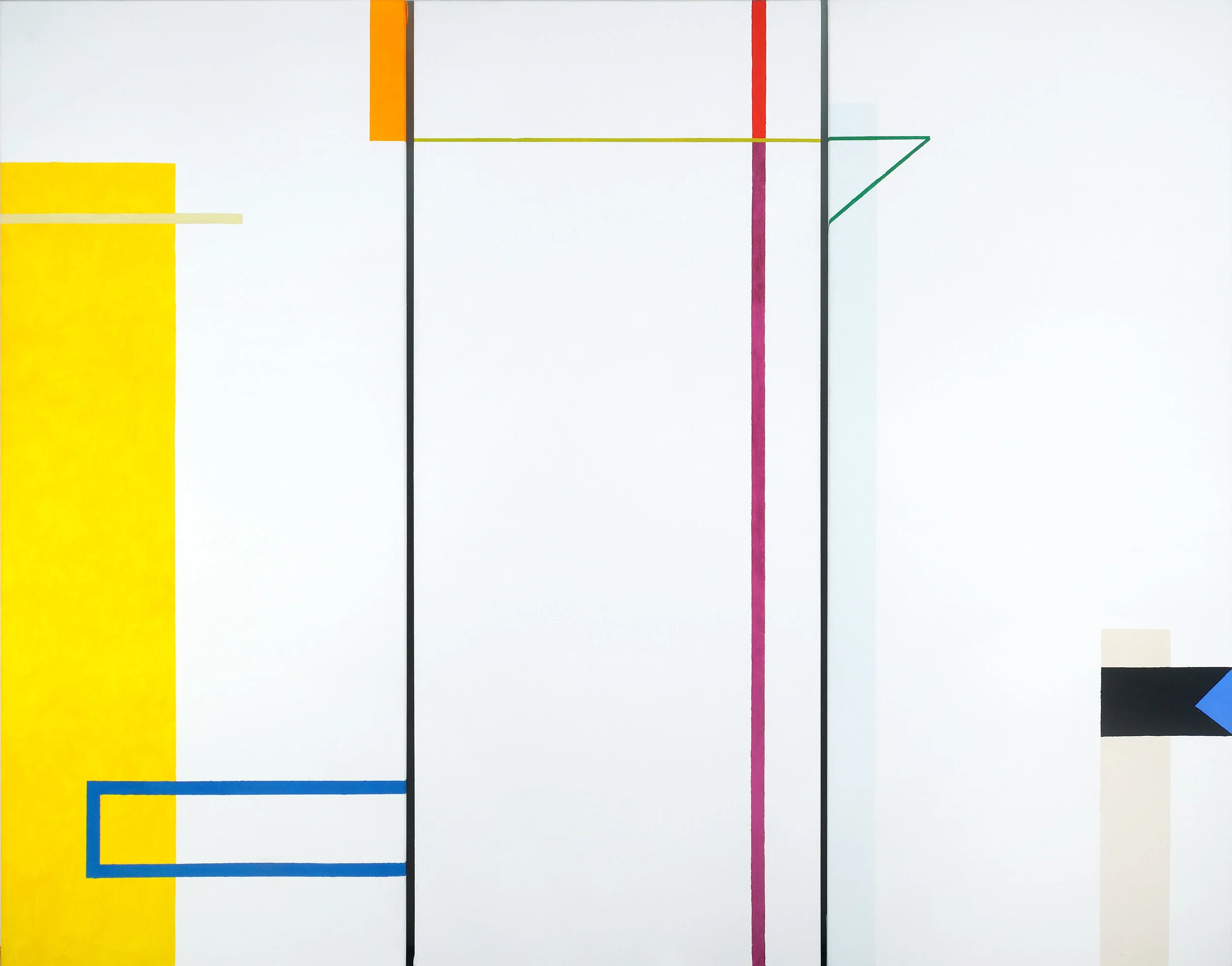
Though clearly most at home with a limited palette, Miss Montgomery has made some bold experiments, playing a sort of balancing act with scattered squares of brilliant primary colors. Some of these work: some don't. The big painting “Informer” for example, predominantly whites and soft grays, densely painted but with a feathery surface texture recalling Mr. Kainen's brushwork, doesn't quite come off. It's all a question of balance. In an abstract work composition is everything. The picture is held together by striking the right harmony between form, color and placement. Ideally there also will be some precarious dynamic to keep the eye moving. The slightest miscalculation, and the picture falls apart.
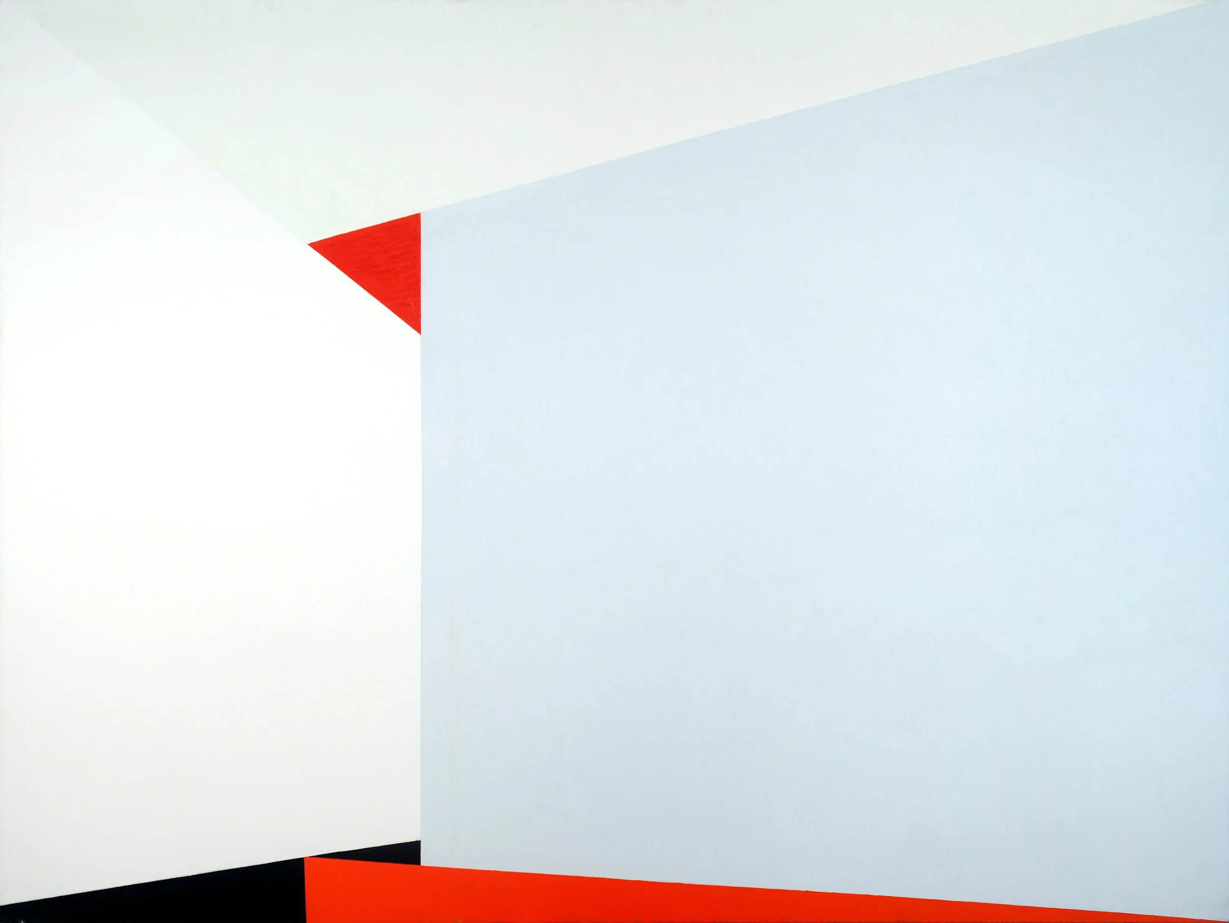
The rigidly sectional piece “Dyad” , also seems a bit severe, a bit too formal. But “Scalene” and a smaller study, dealing with essentially the same formal problems of big intersection planes of flat color, are both superb. In both of these works, the artist has attempted a sort of hat trick; a resolution of three distinct formal elements in a non-objective format: flat color areas, tonal harmony and perspective. And she has achieved a kind of sublime parity with the juxtaposition of tones and linear constructs. Both works withstand long critical examination, and remain highly satisfying to look at. In fact, it's well worth parking yourself in the middle of the floor in front of “Scalene” for half an hour or so, just to give your eyes – and mind – an exercise in harmony.